

There are objects that fill a room, and then there are objects that change how we understand the room. A great design can become so familiar that we stop noticing it. A chair becomes simply a chair. A lamp becomes something switched on at night. A storage unit disappears into the everyday life of a home. Yet behind some of the world’s most recognisable objects are radical ideas about materials, technology, comfort, manufacturing, culture and the way people live. That is what makes a design classic.
What Makes a Design Classic?
A classic is not simply an old object, an expensive piece of furniture, or something that looks good in a photograph. The strongest design classics solve a problem in a way that feels new, remain relevant long after their introduction, and influence the designers who come after them. For creatives working across architecture, interiors, fashion, photography, product design, branding or visual culture, knowing these objects is useful for another reason. They provide a vocabulary. They teach proportion, restraint, materiality, ergonomics, colour, repetition and the relationship between form and function.
Here are some of the design classics every creative should know.
1. The Wassily Chair by Marcel Breuer
Designed: 1925 to 1927
Material: Tubular steel and canvas
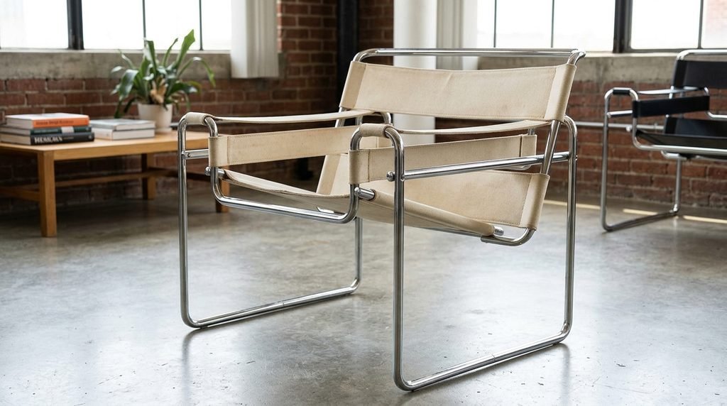
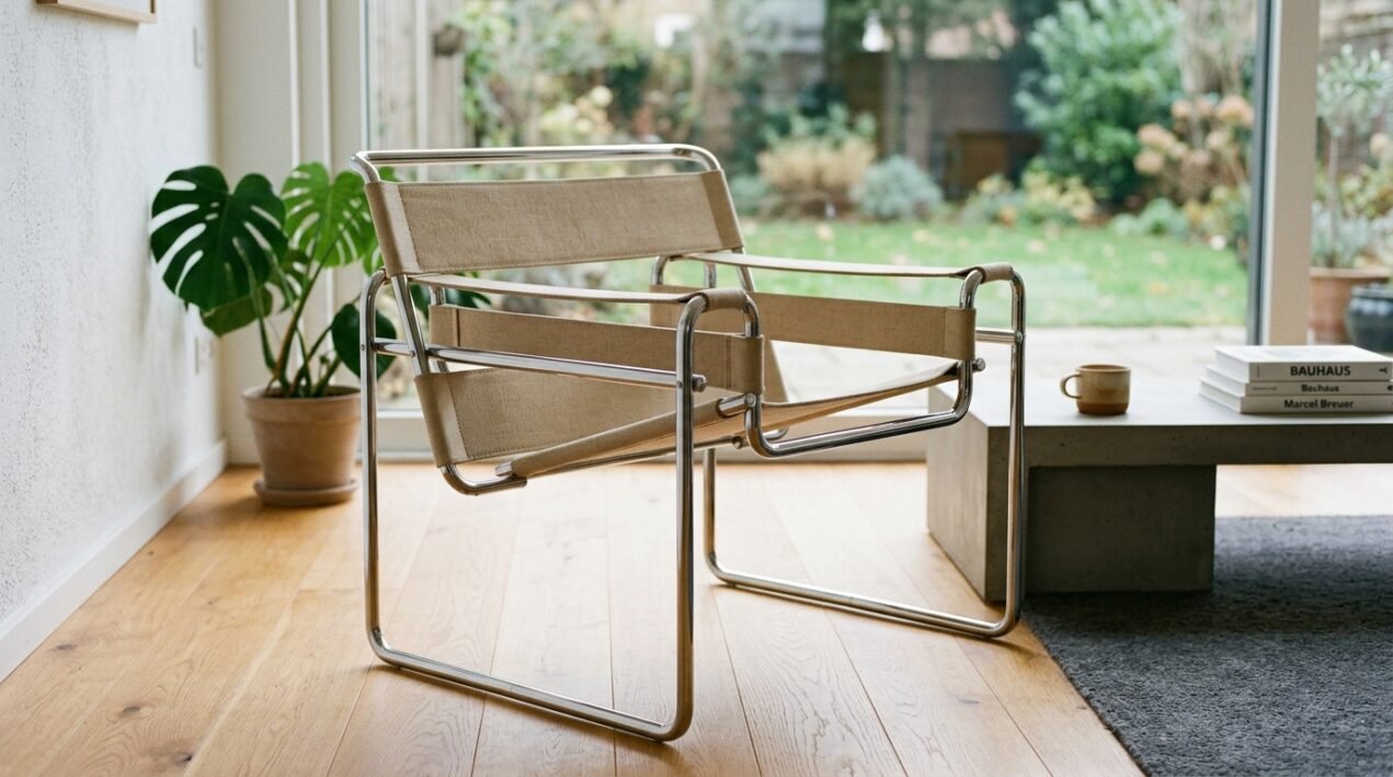
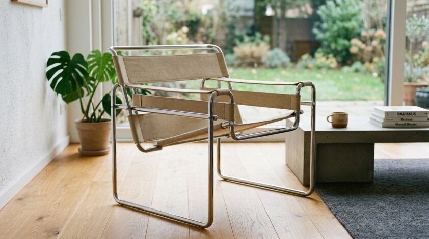
Few chairs announce modernism as clearly as Marcel Breuer’s Wassily Chair. Originally known as the B3 Club Chair, the design emerged from Breuer’s work at the Bauhaus. Its tubular steel frame was inspired, according to MoMA’s account of the design, by the lightweight construction of bicycle handlebars. Breuer recognised that if steel tubing could be bent into a strong, functional bicycle frame, it could also be used to rethink furniture.
The result was strikingly different from the upholstered club chairs that dominated interiors at the time. Instead of hiding its structure, the Wassily makes the structure the visual language. That is the lesson. Good design does not always conceal how something works. Sometimes the construction is the beauty. For architects and product designers, the chair remains a masterclass in reducing an object to its essential components.
2. LC4 Chaise Longue by Le Corbusier, Pierre Jeanneret and Charlotte Perriand
Designed: 1928
Material: Tubular steel, leather or fabric and padding
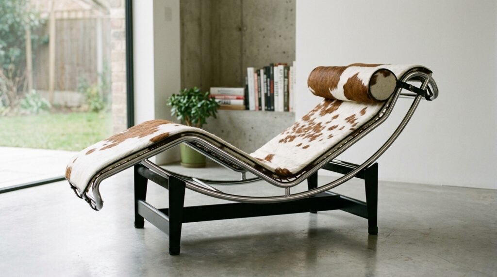
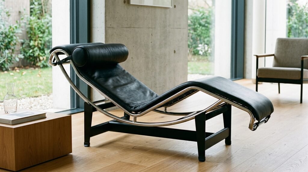
The LC4 is what happens when relaxation becomes a design problem. Created by Le Corbusier, Pierre Jeanneret and Charlotte Perriand in 1928, the chaise longue was developed through a study of reclining and restful seating. Its form allows the user to adjust the position of the body, while the curved frame creates a sense of movement even when the object is stationary.
It is easy to admire the LC4 simply for its sculptural appearance. But its real achievement is the relationship between the human body and the object. The designers did not begin with decoration. They began with use. That principle remains valuable today, particularly for creatives working in furniture, interiors, hospitality and spatial design. Design should serve the body before it serves the photograph.
3. The Barcelona Chair, Ludwig Mies van der Rohe and Lilly Reich
Designed: 1929
Material: Leather and chrome-plated steel
The Barcelona Chair was created for the German Pavilion at the 1929 Barcelona International Exposition. Mies van der Rohe wanted a chair appropriate for the reception of royalty, and the result became one of the defining pieces of modernist furniture. Its appeal comes from discipline. The structure is clear. The proportions are controlled. The upholstery is carefully arranged. There is no unnecessary ornament competing for attention.
The chair demonstrates one of Mies’s most important design principles: when everything has a purpose, very little needs to be added. For creatives, the Barcelona Chair offers a lesson in visual restraint. It proves that minimalism does not have to mean emptiness. It can mean precision.
4. Eames Lounge Chair and Ottoman by Charles and Ray Eames
Designed: 1956
Material: Moulded plywood, leather and aluminium
The Eames Lounge Chair is perhaps one of the clearest examples of luxury meeting industrial design. Charles and Ray Eames introduced the chair in 1956 after years of experimentation with moulded plywood. Their aim was to create a modern interpretation of the traditional English club chair while improving comfort and reducing visual heaviness.
The chair became an icon because it balances several apparently opposing qualities. It feels luxurious but not excessively formal. It is industrially produced but retains a sense of craftsmanship. Most importantly, it is visually distinctive while remaining comfortable.
Vitra notes that the chair continues to be produced using methods that retain the character of the original design, with many production stages still requiring detailed craftsmanship. The creative lesson is simple: Innovation does not require abandoning comfort, craft or emotion. The Eameses understood that people do not experience design intellectually alone. They touch it, sit in it, move around it and develop emotional relationships with it.
5. Panton Chair by Verner Panton
Designed: 1959, developed for production in the 1960s
Material: Plastic
The Panton Chair looks as though it arrived from the future. Verner Panton conceived the idea of a one-piece plastic cantilever chair in the late 1950s. It took years of experimentation before the chair could be manufactured successfully at scale. The first production series appeared in 1967.
Its importance is not only its distinctive S-shaped silhouette. Panton challenged the conventional idea of what a chair needed to look like and how it needed to be constructed. The chair could be made in one piece. It could be produced in strong colours. It could stand alone as an object or work as part of a larger composition. That makes it particularly relevant to contemporary creatives. A new material can produce a new visual language. Panton did not merely use plastic. He allowed the properties of plastic to influence the form itself.
Recommended For You
6. Arco Lamp by Achille and Pier Giacomo Castiglioni
Designed: 1962
Material: Marble, stainless steel and aluminium
The Arco Lamp is one of those objects that makes an ordinary domestic problem feel surprisingly sophisticated. The Castiglioni brothers wanted to create a floor lamp capable of providing light over a table without requiring the light source to be fixed to the ceiling. The answer was a long, elegant curved arm extending from a heavy marble base. The lamp became one of the defining designs associated with Flos, which was founded in 1962 and quickly became a laboratory for experimental lighting and industrial design.
What makes the Arco so compelling is the way its structure communicates its purpose. The marble base provides stability. The long stem creates reach. The suspended lamp produces overhead light without permanent architectural intervention. Nothing is arbitrary. The best design often solves a practical problem while making the solution beautiful.
7. Componibili by Anna Castelli Ferrieri
Designed: 1967
Material: Plastic
Anna Castelli Ferrieri’s Componibili storage system is proof that good design does not have to be grand. First introduced in 1967, the modular system was created to respond to changing domestic needs. Its compact cylindrical form made it useful in different rooms and for different purposes. Kartell describes Componibili as one of its enduring furnishing classics.
Its genius lies in adaptability. A bedside table can become storage. A bathroom organiser can become a living room side table. The object does not dictate a single identity. For contemporary designers working in small apartments, flexible retail spaces, hospitality or modular interiors, that idea remains remarkably relevant. Design should anticipate that people’s lives change.
8. Wishbone Chair by Hans J. Wegner
Designed: 1949
Material: Wood and woven paper cord
Hans J. Wegner’s Wishbone Chair is a lesson in craftsmanship without visual excess. The chair’s distinctive Y-shaped back gives it its familiar name, while its combination of a solid wooden frame and woven seat creates a balance between structure and softness. It belongs to the tradition of Danish modernism, where craftsmanship and everyday functionality were brought together without unnecessary decoration.
For creatives, the Wishbone Chair demonstrates how a recognisable identity can emerge from a small number of carefully considered details. The lesson is particularly useful for branding and product design. You do not need ten distinctive elements when one or two are strong enough.
9. Aeron Chair by Bill Stumpf and Don Chadwick
Designed: 1992 to 1994
Material: Mesh suspension, plastic and metal
The Aeron Chair changed the visual and functional language of office seating when it launched in 1994. Designed by Bill Stumpf and Don Chadwick for Herman Miller, it was developed through extensive research into how people sit and how office furniture could better support the human body.
Its exposed suspension material was especially important. Instead of covering the chair with the thick upholstery traditionally associated with executive office furniture, the designers made the technology visible. The chair eventually entered the permanent collection of the Museum of Modern Art.
More importantly, it demonstrated that ergonomics could be part of the aesthetic rather than something hidden beneath it. Function is not the enemy of beauty. For digital product designers, UX designers and architects, the Aeron offers a useful reminder that a beautiful experience is often the result of careful attention to how people actually behave.
10. Eames Molded Plywood Chair
Designed: 1940s
Material: Moulded plywood
Before the famous Lounge Chair came the experiments that made it possible. During the Second World War, Charles and Ray Eames developed techniques for moulding plywood into complex curves. Their work included leg splints for the US Navy, which helped advance their understanding of moulded plywood. The experiments eventually informed a series of furniture designs.
The importance of these chairs lies partly in the process. The Eameses did not arrive at a finished icon in one stroke. They experimented. They tested materials. Ohhh! They failed. They adjusted. For young creatives, that may be the most useful lesson of all. A classic is often the visible result of years of invisible experimentation.
What Makes a Design Classic?
Looking across these objects, a pattern begins to emerge. They are not classics simply because museums collect them or because they appear repeatedly in design magazines. They became classics because they changed something.
- Breuer changed what furniture could be made from.
- Mies and Reich demonstrated the power of structural clarity.
- Le Corbusier, Jeanneret and Perriand placed the body at the centre of the design problem.
- The Eameses showed how industrial production could coexist with comfort and craft.
- Panton turned plastic into a sculptural language.
- The Castiglioni brothers transformed a lighting problem into an architectural object.
- Castelli Ferrieri made modularity part of everyday domestic life.
- Stumpf and Chadwick made ergonomics visible.
The objects are different, but the thinking behind them shares a common thread. They were designed with intention.
Why Creatives Should Study Design Classics
For a young creative, studying design history can sometimes feel disconnected from contemporary practice. The opposite is true. Design classics are visual case studies. They show how an idea becomes a form. They demonstrate how materials influence aesthetics. Not to mentation that they reveal how technology can create new possibilities. They show why proportion matters and how repetition creates recognition.
They also teach creatives to ask better questions.
- What problem am I actually solving?
- Who is going to use this?
- What does the material want to do?
- What can I remove?
- What needs to remain?
- Can the object evolve?
- Will the idea still make sense in ten years?
These questions are as relevant to a fashion designer creating a garment as they are to an architect designing a building, a graphic designer developing a visual identity or a creative director shaping a brand.
The Difference Between Timeless and Trendy
There is a reason these objects continue to appear in contemporary spaces. Trends depend heavily on recognition. Classics depend on relevance. A trend tells you what is fashionable now. A classic gives you an idea that can survive fashion. That distinction matters in an age of rapid visual consumption. Social media can make a colour, silhouette, interior style or product appear everywhere within weeks. It can also make it disappear just as quickly.
The design classics move differently. They have lasted because their ideas are stronger than the moment in which they were created. That does not mean they should be copied. In fact, copying the surface of a classic without understanding its thinking usually produces little more than imitation. The more useful approach is to study the decisions behind the object.
- Why this material?
- Why this proportion?
- Why this colour?
- Why this mechanism?
- Why this shape?
- And most importantly, why did this design need to exist?
Design History Is a Creative Toolkit
The greatest value of studying design classics is not memorising names and dates. It is learning how to see. Once you understand why the Wassily Chair exposes its structure, why the Barcelona Chair depends on proportion, why the Panton Chair embraces plastic, why the Eames Lounge Chair balances industrial production with comfort, or why the Arco Lamp turns a practical limitation into an elegant form, you begin to look differently at the objects around you.
A chair stops being just a chair. A lamp becomes a solution. A piece of furniture becomes an argument. And design becomes what it has always been at its best: a way of deciding how we want to live.