


Choosing the right tile colours for your decor is a fun and creative activity, but it can also prove daunting due to the sheer number of options available on the market. While some people simply choose the tiles and the colours that they love, did you know that colours can play an important role in developing the vibe of your space?
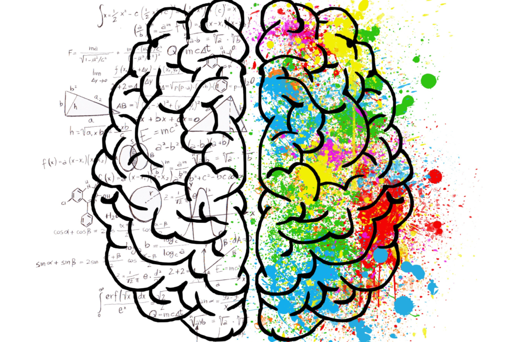
Colours can affect the way you think and feel. The study of how colours affect your psyche is known as colour psychology. Colours can affect how you think, feel, and act, which makes it essential to choose colours in such a way that they suit the utility of the room. For instance, did you know that there are numerous benefits to using an orange two-colour combination for the bedroom or that there are many reasons why you should choose blue for your study?
Read on to understand more about how colours can affect your psychology and how to choose a combination of coloured wall tiles and floor tiles for your room.
The Colour Wheel
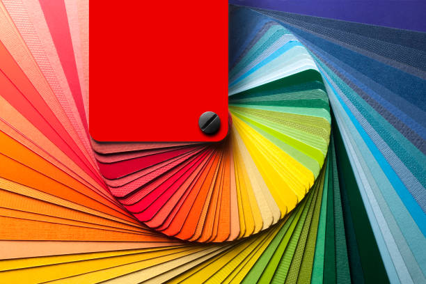
Colour, if speaking in terms of physics, is how our eyes and brain understand the different wavelengths of light that are reflected off various objects. The colour wheel is a combination of various shades that can be used to browse colours and understand what shades complement and contrast each other.
The three primary colours from which all other colours are derived are yellow, red, and blue. These colours are combined in various proportions to create secondary colours, which are orange, green, and violet. The secondary colours are combined to create tertiary colours, which are blue-green, yellow-green, red-purple, blue-purple, yellow-orange, and red-orange. All these colours come together to make the colour wheel.
Here are a few basics of the colour wheel that can help you understand colour psychology in detail and help you choose an amazing colour combination for any room.
Complementary colours
Colours that are neighbours to each other in the colour wheel are known as complementary colours. They are generally suitable to be used as accent colours. You can choose them to make interesting colour combinations for the room.
Triads
These are the colours that form various triangles on the colour wheel. Examples include violet, orange, and green. Triads can be used as accent colours, but they should be balanced neatly.
Analogous colours
These are the three colours that sit next to each other: red, orange, and red-orange. These can be used as bedroom tile colours.
Monochromatic colours
As the name suggests, this scheme is made of only one colour but may include different shades of the same colour. For instance, teal, aqua, navy, sky, etc.
Cool and warm colours
Cool colours invoke a cool feeling. They include greens, blues, and purples.
Warm colours remind us of the sun or fire and thus invoke a warm feeling. They include pinks, yellows, reds, oranges, etc. These colours can be used to create a particular feeling or mood in any room. There are numerous interior colour combinations for bedrooms to choose from.
Non-colours
These are all the colours that are important to interior decoration but are not available on the colour wheel. They include grey, white, black, brown, and beige. These make for really interesting bedroom colour combinations.
Tile Colour Psychology
Let us now take a look at what each colour means and the psychology behind the shades.
Red Tile
Red is considered a bold colour. It stands for power, passion, love, desire, strength, energy, war, and danger. It can be used to stir up excitement and raise energy in a particular room. Different shades of red invoke different feelings. For instance, you can make a modern bedroom and paint it two colours.
- Light red: Invokes sexuality, love, passion, joy, and sensitivity.
- Pink: Romance, love, and friendship
- Reddish brown: Earth, fall, and harvest
- Dark red: Courage, leadership, vigour, and boldness
Red tile can be used as an accent in any ‘cool’ space. It can also produce dazzling and dramatic results.
Orange Tile
Orange tiles can be used to provide a burst of energy and vigour. It reminds people of sunshine, the tropics, and joy and represents encouragement, enthusiasm, creativity, fascination, determination, success, attraction, and stimulation. Different shades of orange can invoke diverse feelings:
- Bright orange: Warmth, excitement, adventure
- Red-orange: Pleasure, dominance, desire, passion
- Dark orange: Ambition and confidence
- Gold: Wisdom, prestige, wealth, and richness
There are many ways in which you can create a stunning orange colour combination in your bedroom. Just combine the colours together. Stay up to date on the newest in the world of Fashion, Arts, Beauty and Lifestyle; Follow FAB on socials.
Yellow Tile
Yellow is considered to be the colour of energy, sunshine, joy, happiness, and intellect. It can also boost creativity, and communication can boost the nervous system as well as your memory. Dull yellows, however, should be avoided.
- Dull yellow: Sickness, jealousy, caution, decay
- Light yellow: Intellect, freshness, joy
- Bright yellow: Optimism
- Deep yellow: Sophistication
Yellow tiles are perfect for kitchens, bathrooms, dining rooms, and any other rooms that need a lot of energy.
Choose the best colour combination for your bedroom according to your requirements.
Green Tile
Green is the colour of leaves, grass, and various other natural elements, making it a soothing colour. It stands for fertility, growth, harmony, freshness, and new beginnings.
- Yellow-green: Joy and cheeriness
- Aqua: Emotional healing and protection
- Olive green: Peace
- Dark green: Ambition
This colour is suitable to be used in any corner or room of your house.
Blue Tile
This colour reminds people of the ocean and the sky. It stands for calm, freshness, dependability, strength, confidence, truth, loyalty, intelligence, trust, faith, wisdom, and heaven.
- Pastel blue: Healing, understanding, health, softness, tranquillity
- Dark blue: Seriousness, power, integrity, and knowledge
- Midnight blue: Luxury
This coloured tile can be used in any room where you want to feel calm and relaxed. It is great for bathrooms, bedrooms, and kitchens.
Purple Tile
Purple has always been the colour of creativity, luxury, and royalty. It is a mixture of calming blue and bold red. Dark purples can provide any room with a touch of drama, richness, sophistication, and regality. Dark purples can also make a room look eccentric and exotic. Lighter shades of purple are soothing and look dainty.
Purple tiles can be used to make an otherwise neutral tile combination look bold and bright. They can also be used to add depth to a room.
White Tile
White is the colour of cleanliness, purity, innocence, wholeness, completion, peace, hope, calm, comfort, protection, encouragement, and love. It can be used to declutter your life and your mind. These tiles look clean, fresh, and nice.
These tiles can be used to make any room look bigger, but incorrect use may make the room look barren, sterile, and cold. They should be balanced with accent pieces or other tiles for a more complete look.
Grey Tile
Grey is the colour of serenity, calmness, elegance, and sophistication. Solid greys stand for confidence and strength; softer greys stand for comfort, delicacy, and thoughtfulness.
You can use grey tiles as a neutral backdrop and pair them with various colours for an interesting look. Grey, if used properly, can add a touch of elegance to any room.
Black Tile
Black tile is generally associated with elegance, luxury, sophistication, and class. If used correctly, it can create a sense of drama, mystery, and power. This is a colour that is suitable for both traditional and modern décor.
It is recommended to avoid using black tiles in a heavy-handed way. You can use them in smaller spaces, like bathrooms.
Beige & Brown Tile
Brown and beige colours stand for security, stability, groundedness, and relaxation. They remind people of nature and are quite weighty and robust. They can make any space feel inviting, warm, and comforting.
Brown and beige can be used in almost all rooms of your house and are highly suitable for studies and bedrooms.
Multicolor Tile
You may also choose to add multiple colours to your room or your house. You can choose alternate tiles, printed tiles, various colour combinations, such as two colour combinations for walls, etc. for a chic, modern, and interesting look.
Why Should You Choose the Right Colour?
Certain colours can change the look and vibe of a room. It is therefore recommended to choose colours wisely and make a final decision. Always choose a tile colour that suits your personality, your space, and a colour that you are comfortable with. Explore eFab Summer Edition now!
Colours Can Communicate
The colours we like have a deep meaning and also serve as a reflection of how, what, and why we feel. It is therefore recommended to understand the colour wheel and use the above tips to choose the right coloured tiles.
Credit: Isha Tandon


